In the age of information overload, where headlines scream conflicting narratives and pundits offer a cacophony of opinions, finding clarity in the financial markets can feel like a Herculean task. For every bullish argument, there’s an equally compelling bearish case. For every data point suggesting economic strength, another hints at imminent weakness. How can an investor, a business leader, or simply an interested observer cut through the noise?
The answer, more often than not, lies not in words, but in pictures. A single, well-constructed chart can tell a more powerful and truthful story than a thousand-word essay. It can strip away bias, reveal underlying trends, and provide a visual anchor in a sea of volatility.
This weekly series, “The Week in Charts,” is dedicated to that very principle. We will move beyond the daily gyrations of the Dow Jones or the S&P 500 to focus on the foundational data—the tectonic plates shifting beneath the market’s surface. By analyzing a curated selection of five critical charts each week, we can assemble a coherent narrative of the US economy and financial landscape, providing you with the context needed to make informed decisions.
As a market analyst with over 15 years of experience navigating multiple market cycles, from the 2008 Financial Crisis to the 2020 pandemic crash, I’ve learned that sustainable success hinges on understanding these core drivers, not on chasing daily headlines. The charts selected are based on this experience, focusing on indicators with a proven historical track record for signaling major economic shifts.
Let’s dive into the five visuals that explain everything in US markets this week.
Chart 1: The Federal Reserve’s Balancing Act – The Treasury Yield Curve
The Chart:
A line graph showing the yields of US Treasury bonds across different maturities, typically from 1 month to 30 years. The key feature to observe is the “shape” of the curve—is it upward sloping (normal), flat, or inverted?
Why It’s the Most Important Chart Right Now:
The Treasury yield curve is arguably the most reliable recession predictor in modern finance. It represents the interest rates the US government pays to borrow money for various lengths of time. In a healthy, growing economy, the curve slopes upward. Lenders demand higher yields for longer-term loans to compensate for the increased risks of inflation and uncertainty over time.
However, when the curve “inverts”—meaning short-term interest rates are higher than long-term rates—it flashes a severe warning sign. This inversion has preceded every US recession since 1955, with only a few false positives. The most common measure is the spread between the 10-year and 2-year Treasury yields.
The Current Narrative:
As of this week, the 2s-10s spread remains deeply inverted.
What This Chart Is Telling Us:
- Pessimistic Long-Term Outlook: An inverted curve signals that bond market investors are pessimistic about the economy’s long-term prospects. They are piling into long-term bonds, driving their prices up and yields down, because they anticipate weaker growth and potentially lower inflation (or even deflation) in the future.
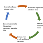
- Aggressive Federal Reserve Policy: The primary driver of the current inversion is the Federal Reserve’s aggressive interest rate hiking cycle. By sharply raising the Federal Funds rate (a short-term rate), the Fed has pushed up the yields on short-duration Treasuries. The long end of the curve, however, is reflecting the market’s belief that this tight monetary policy will ultimately slow the economy so much that the Fed will be forced to cut rates in the future.
- A Credit Crunch Warning: Banks fundamentally make money by borrowing short-term (paying short-term rates) and lending long-term (earning long-term rates). An inverted curve squeezes this model, disincentivizing lending. A prolonged inversion can lead to a credit crunch, where businesses and consumers find it harder and more expensive to get loans, which in turn slows economic activity.
The Investor Takeaway:
Do not ignore this chart. While the timing between an inversion and a recession is notoriously variable (anywhere from 6 to 24 months), its signal is powerful. It suggests that underlying economic weakness is brewing beneath the surface of resilient stock market rallies. For investors, this is not a signal to panic-sell everything, but rather a call to prudence: reduce leverage, ensure portfolio quality, and avoid overexposure to the most speculative, interest-rate-sensitive parts of the market.
Chart 2: The Engine of the Economy – The US Labor Market
The Chart:
*A combination chart showing: 1) The monthly change in Non-Farm Payrolls (bar graph). 2) The Unemployment Rate (line graph). 3) A supplementary chart for Wage Growth (Average Hourly Earnings, line graph).*
Why It’s Critical:
The consumer is the bedrock of the US economy, accounting for roughly two-thirds of GDP. The health of the consumer is almost entirely a function of the health of the labor market. If people have jobs and their wages are growing, they can spend. If they lose jobs, spending contracts, and the economy tips into a recession. The Federal Reserve is also intensely focused on this data; a strong labor market can fuel inflation, influencing their interest rate decisions.
The Current Narrative:
The labor market has been a paradox of strength. Despite the Fed’s rapid rate hikes, hiring has remained remarkably robust, and the unemployment rate has hovered near multi-decade lows. However, recent reports have begun to show subtle, yet critical, signs of cooling.
What This Chart Is Telling Us:
- Resilience, but Moderation: The monthly payroll number continues to be positive, meaning the economy is still adding jobs. However, the pace of gains is decelerating. A 3-month moving average of this data can smooth out volatility and show a clearer trend of moderation. This is the “soft landing” scenario the Fed is hoping for—a gradual cooling, not a sudden collapse.
- The “Sahm Rule” Signal: The unemployment rate itself is a lagging indicator, but its rate of change is not. A reliable rule of thumb, the Sahm Rule, states that when the 3-month moving average of the unemployment rate rises by 0.5 percentage points or more relative to its low over the previous 12 months, the economy is already in a recession. We are not there yet, but any sustained uptick from the current level is a critical data point to watch.
- The Inflation Connection (Wage Growth): Wage growth is the link between the labor market and inflation. Strong wage gains support consumer spending but can also force companies to raise prices to cover labor costs, creating a wage-price spiral. The Fed is watching this metric closely. The current trend shows wage growth moderating from its peak but still running above the pre-pandemic pace, which is why the Fed remains cautious about declaring victory over inflation.
The Investor Takeaway:
The labor market is the shock absorber for the economy. Its continued strength is the primary reason a recession has not yet materialized. Investors should watch for a sustained breakdown in this data. A sudden, sharp jump in weekly jobless claims or a significant miss on payroll numbers would be a powerful signal that the Fed’s medicine is finally working with a lag and that economic contraction is imminent. For now, the message is one of resilient but fading strength.
Chart 3: The Fed’s Primary Battlefield – Core PCE Inflation
The Chart:
A line graph tracking the year-over-year (YoY) and month-over-month (MoM) percentage change in the Core Personal Consumption Expenditures (PCE) Price Index.
Why It’s the Fed’s Favorite Gauge:
While the Consumer Price Index (CPI) often grabs headlines, the Federal Reserve officially targets the PCE price index, and specifically Core PCE, which excludes the volatile food and energy components. The Fed believes Core PCE provides a cleaner, more accurate picture of underlying, persistent inflation trends.
The Current Narrative:
The story of inflation over the past year has been one of dramatic decline from the 40-year peaks witnessed in 2022. The “easy” disinflation, driven by the normalization of supply chains and the collapse of goods prices, has largely occurred. The battle now is against the “last mile” of inflation, which is proving stickier and is heavily concentrated in service sectors (like healthcare, housing, and hospitality) that are more sensitive to wage pressures.
What This Chart Is Telling Us:
- The “Last Mile” is the Hardest: The descent of Core PCE has slowed considerably. It is now hovering well above the Fed’s 2% target. The month-over-month data is particularly important; to get the annual rate down to 2%, the MoM readings need to average around 0.2% or lower. Any persistent reading above 0.3% MoM suggests inflation is stalling at an uncomfortable level.
- The Shelter Problem: A significant component of Core PCE (and CPI) is “shelter,” or housing costs. There is a massive lag in this data, as it captures all rental leases, not just new ones. Real-time market data shows rents are flat or falling, but this won’t be fully reflected in the official inflation data for several more months. The Fed is banking on this “shadow disinflation” in housing to help pull down Core PCE throughout the year.
- Super-Core Services: The Fed is now intensely focused on “Super-Core” inflation, which is Core Services excluding housing. This metric is seen as the purest gauge of domestic wage-pressure-driven inflation. Its trajectory is crucial. If it remains stubbornly high, it will give the Fed cover to keep rates “higher for longer,” even if the broader economy weakens.
The Investor Takeaway:
This chart directly dictates Federal Reserve policy. The path of interest rates is the single most important driver of asset valuations. Until Core PCE shows a consistent and convincing path back to 2%, the risk of restrictive monetary policy remains elevated. For the stock market to sustain a new bull market, it needs confirmation from this chart that the inflation fight is truly won. Watch the MoM readings like a hawk.
Chart 4: The Market’s Collective Psyche – The S&P 500 Market Breadth
The Chart:
*A chart comparing the performance of the S&P 500 Index (price return) with a line showing the percentage of S&P 500 stocks trading above their 200-day moving average.*
Why It Reveals Underlying Health:
The headline S&P 500 index, driven by its market-capitalization weighting, can be deceptive. A rally powered by just a handful of mega-cap tech stocks (like the “Magnificent Seven”) is very different from a broad-based rally where the majority of stocks are participating. The latter is a sign of a healthy, sustainable bull market. The former is a sign of narrow, fragile leadership.
The Current Narrative:
For much of 2023, the market’s gains were astonishingly narrow. A small cohort of AI-darling stocks accounted for the vast majority of the S&P 500’s return. While the index made new highs, the percentage of stocks above their long-term trend (the 200-day moving average) was languishing. This is a condition known as poor “market breadth.”
What This Chart Is Telling Us:
- A Tale of Two Markets: When the index is hitting new highs but market breadth is weak, it indicates a “top-heavy” market. It suggests that the average stock is not doing well; the gains are being masked by the outsized influence of a few giants. This is a classic sign of risk-aversion, where investors crowd into the perceived safety and growth of the largest companies.
- A Warning Sign for Sustainability: Historically, periods of extremely poor breadth have often preceded significant market corrections. If the leadership of the few mega-caps falters, there is little support from the broader market to hold up the index. It’s like a table with only three strong legs—it can stand, but it’s unstable.
- A Shift in Narrative? Recently, we have seen attempts at a broadening of the rally. If the percentage of stocks above their 200-day moving average begins to rise significantly alongside new index highs, it would be a very bullish signal, indicating that the rally is becoming more inclusive and fundamentally healthier.
The Investor Takeaway:
Don’t just watch the index level. Look under the hood. Strong, improving market breadth is a key pillar of a durable bull market. If you see the S&P 500 making new highs while this breadth indicator is deteriorating, it should serve as a caution flag. It may be a signal to take some profits in the high-flying leaders and consider rebalancing into areas of the market that have been left behind.
Read more: The Weekly Pulse: Can the Bull Run Continue as the Fed’s Decision Looms?
Chart 5: The Global Economic Pulse – Copper vs. Gold Ratio
The Chart:
A ratio chart created by dividing the price of Copper by the price of Gold.
Why It’s “Dr. Copper”:
The commodity market offers raw, unfiltered insights into global economic activity. Copper, nicknamed “Dr. Copper” for its PhD in economics, is an industrial metal fundamental to construction, manufacturing, and electrification. Its price reflects expectations for global growth. Gold, on the other hand, is a timeless safe-haven asset. It thrives on fear, uncertainty, and geopolitical turmoil. It performs well when real interest rates are low and investors seek safety.
The Current Narrative:
The ratio of Copper to Gold is a powerful barometer of global risk appetite. When the ratio is rising, it means copper is outperforming gold, signaling confidence in economic growth (risk-on). When the ratio is falling, it means gold is outperforming copper, signaling fear and a flight to safety (risk-off).
What This Chart Is Telling Us:
- Global Growth Expectations: A rising Copper/Gold ratio suggests the market is pricing in stronger industrial demand and a healthy global manufacturing cycle. This is typically associated with periods of economic expansion.
- Flight to Safety: A falling ratio is a clear warning sign. It indicates that concerns about economic slowdown, recession, or systemic financial stress are trumping the demand for industrial inputs. Investors are choosing the safety of gold over the growth-sensitive copper.
- A Conflicting Signal (The Current State): Recently, we have seen a intriguing tug-of-war. Copper prices have shown resilience on bets for a manufacturing recovery and the long-term demand from the green energy transition. Simultaneously, gold has hit record highs on persistent geopolitical risks and central bank buying. This creates a noisy signal in the ratio, but its overall trend can still provide clues. A breakdown in the ratio would be a concerning sign for global cyclical assets.
The Investor Takeaway:
This ratio is a fantastic “sanity check” on the messages from other financial markets. If the stock market is rallying but the Copper/Gold ratio is collapsing, it suggests the equity rally may be built on shaky fundamentals. Conversely, a strong or improving ratio can confirm a bullish outlook for global cyclical stocks, industrial sectors, and emerging markets. It connects the dots between Wall Street and Main Street on a global scale.
Conclusion: The Composite Picture
Individually, each of these five charts tells a vital part of the story. But their true power is revealed when we synthesize them into a single, coherent narrative.
The current composite picture is one of tension and transition.
- The Yield Curve is screaming “Recession Ahead!”
- The Labor Market is whispering, “Not so fast, the consumer is still strong.”
- The Inflation (Core PCE) chart is telling the Fed, “We’re not done with our fight yet.”
- The Market Breadth is cautiously asking, “Is this rally for real, or just a few stocks?”
- The Copper/Gold Ratio is caught between a global industrial recovery and persistent safe-haven demand.
This is the essence of market analysis. There is no single, easy answer. The economy is a complex, adaptive system sending mixed signals during pivotal turning points. The message for investors is one of balanced caution and opportunity. It is a time for discipline, diversification, and a focus on high-quality assets. It is a time to watch the data, not the headlines.
By making these five charts a regular part of your analytical routine, you equip yourself with the tools to see beyond the daily noise and understand the fundamental forces shaping your financial future. Tune in next week as we update these visuals and continue to chart the course of the US markets.
Read more: Bond Market Blues: Why Treasury Yields are the Key to Understanding Equity Volatility
FAQ Section
Q1: Why do you focus on the 2s-10s Treasury spread and not another part of the yield curve?
The spread between the 10-year and 2-year Treasury notes is the most widely watched and historically significant measure. It effectively captures the market’s comparison of medium-term economic expectations (10-year) against the immediate policy outlook set by the Fed (2-year). Other parts, like the 3-month/10-year spread, are also predictive, but the 2s-10s remains the market’s primary benchmark.
Q2: If the yield curve is inverted, why is the stock market still going up?
This is a classic occurrence and a key reason why timing the market is so difficult. The stock market is a forward-looking mechanism that often bottoms during a recession, not before it. A rally during an inversion can be driven by several factors: 1) Hope that the Fed will successfully engineer a “soft landing.” 2) Strong earnings from specific sectors (e.g., AI). 3) A “there-is-no-alternative” (TINA) mindset if bond yields are low. However, history shows that such rallies can be “suckers’ rallies” if a recession ultimately materializes.
Q3: What is the difference between CPI and PCE, and why does the Fed prefer PCE?
Both measure inflation, but they do so with some key methodological differences. The CPI (Consumer Price Index) is based on a survey of what urban households are buying, while the PCE (Personal Consumption Expenditures) is based on what businesses are selling. The Fed prefers PCE because it has a broader scope of expenditures, its formula adjusts for consumer substitution (when people switch from expensive to cheaper goods), and it is less volatile. In practice, they move together over the long run, but the Fed’s official target is based on PCE.
Q4: How can I access these charts for myself?
Many of these charts are freely available on financial websites:
- Treasury Yield Curve: FRED (Federal Reserve Economic Data) at fred.stlouisfed.org is an excellent source.
- Labor Market Data: The Bureau of Labor Statistics (BLS) website releases the reports. Sites like TradingEconomics.com visualize the data well.
- Inflation (PCE): The Bureau of Economic Analysis (BEA) releases this data. FRED also has it.
- Market Breadth: Charting platforms like StockCharts.com allow you to plot the S&P 500 alongside its breadth indicators (e.g.,
$SPX:$SPXA200Rfor the percentage above the 200-day MA). - Copper/Gold Ratio: Most financial data terminals (like Bloomberg) and websites (like Investing.com) allow you to create a custom ratio symbol (e.g., HG.CMX/GC.CMX).
Q5: As a long-term investor, how much should I worry about these short-term signals?
For a genuine long-term investor (with a time horizon of 7-10+ years), these signals are more for context and education than for drastic portfolio action. The core principles of long-term investing—dollar-cost averaging, diversification, asset allocation, and investing in high-quality companies or funds—should always take precedence. However, understanding these signals can help you avoid behavioral mistakes, such as becoming overly euphoric during a narrow, speculative rally or panic-selling during a temporary economic scare. They provide the emotional discipline to stick to your long-term plan.